The Action Bar Framework
Company:
Stori
Role:
Sr Product Designer
Location:
Mexico City
Date:
2024
When I joined Stori, I noticed that multiple teams were competing for space on the Home screen — each with its own goals and priorities. This created friction and diluted the overall experience. We needed more than a visual adjustment; we needed structure. The Action Bar became that framework — a shared layer to centralize key actions, reduce friction, and bring clarity for users and teams.
As the Product Designer leading the Home experience, I drove the vision, architecture, and design of the Action Bar: a framework built to centralize critical actions, reduce user friction, and align cross-team priorities. I partnered with the Home Product Lead, UX Writing, Legal, and multiple squads (Credit, Cuenta+, Growth) to define a shared communication model and visual hierarchy that could scale across Stori’s ecosystem.


Challenge The core problem wasn’t aesthetic — it was organizational chaos. There was no unified space to communicate urgency to users, and no rules to decide what should appear first. We needed to create a structured, scalable system that could host cross-team actions without clutter. Balance urgency and brand voice, ensuring users understood what required attention — without creating anxiety. Orchestrate data dependencies across backend systems so that actions appeared contextually and in real time.
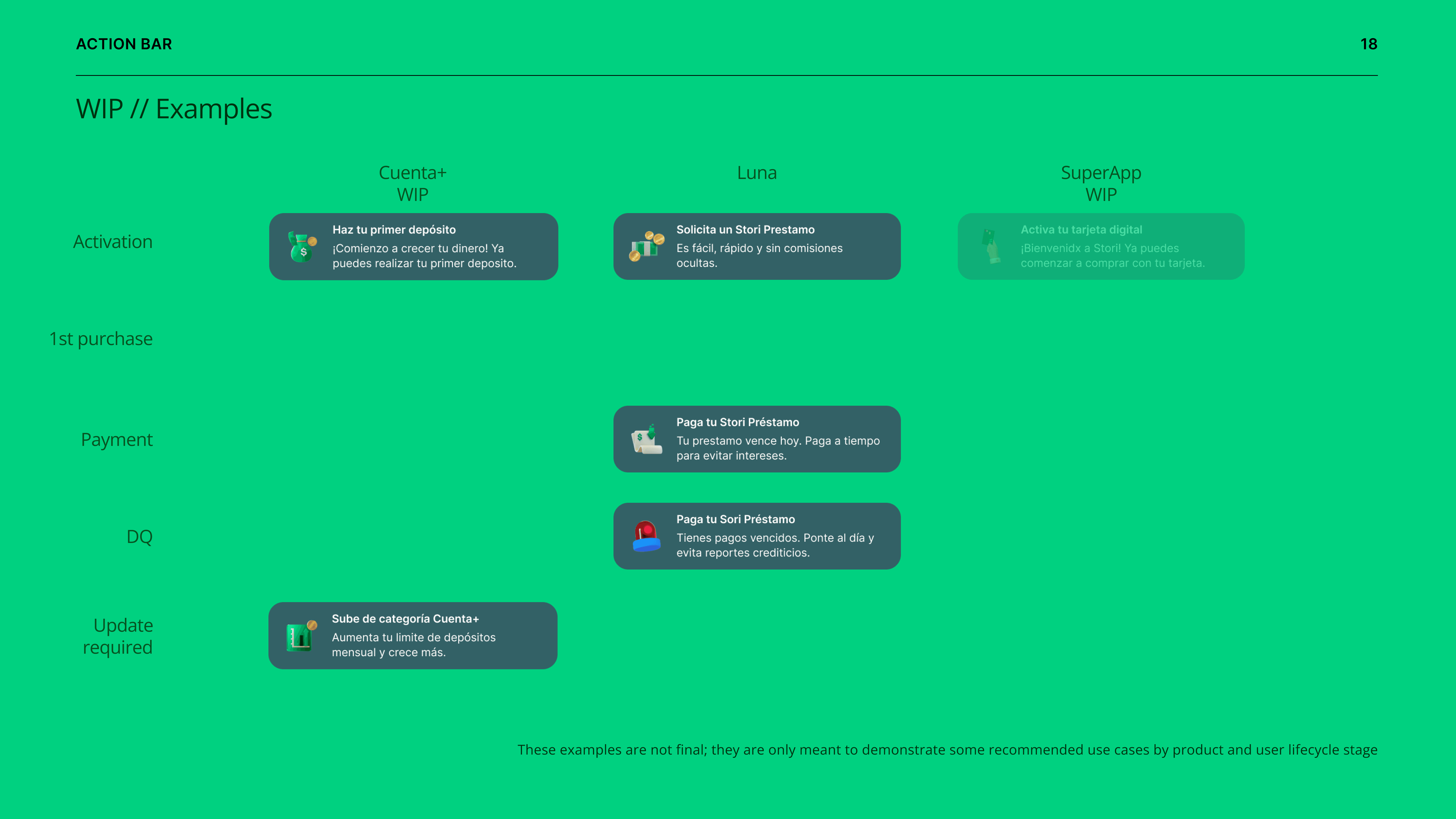
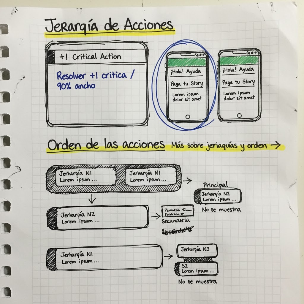
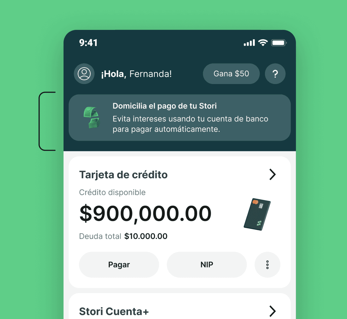
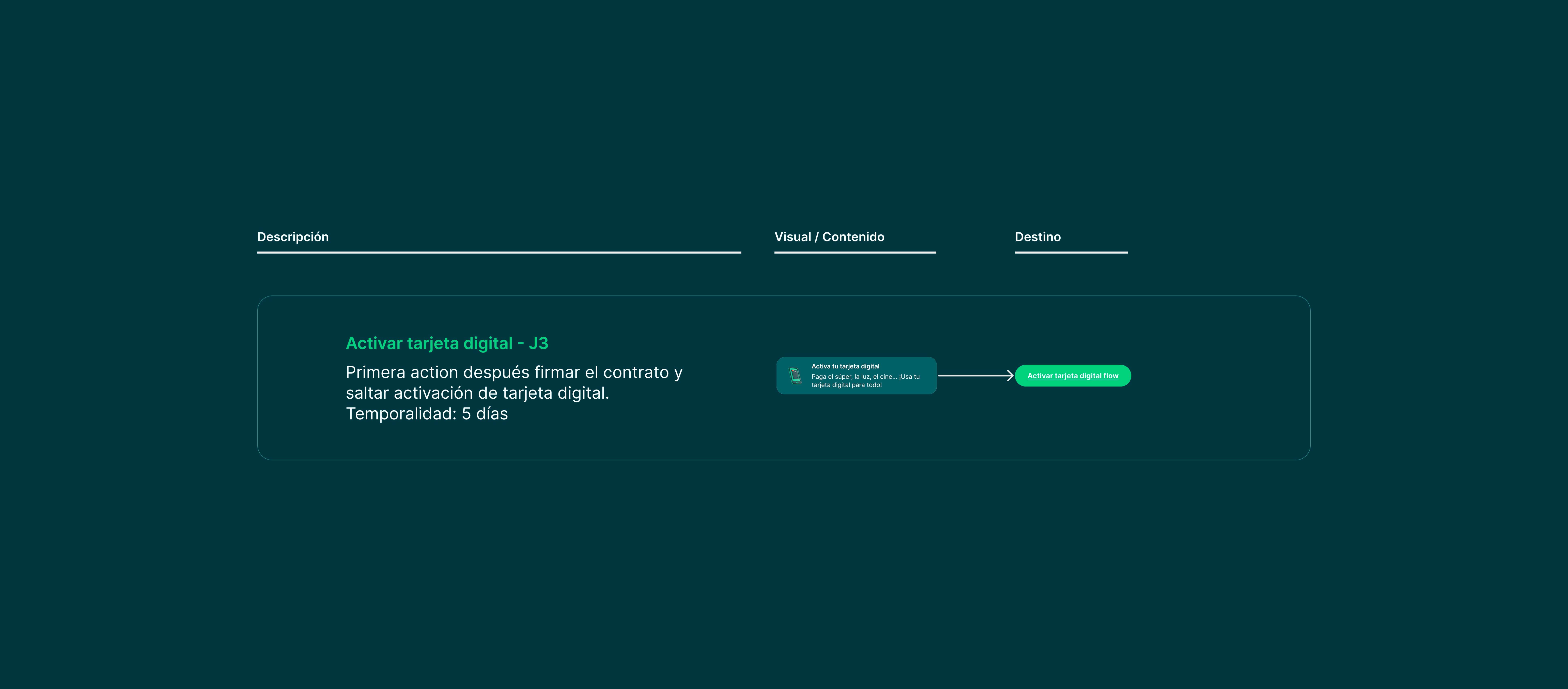
Process Building Governance We introduced a governance model that set the foundation for how teams collaborate within Home. Requests for new actions followed a structured workflow, reviewed by the Home Product Lead and prioritized based on user impact, urgency, and business value. This framework prevented overlap and created accountability across squads — transforming the Action Bar into a shared company asset instead of a design feature. Designing the Architecture The component was built as a dynamic orchestration layer: Rules and conditions were managed through backend services that pulled inputs from multiple teams (Credit, Cuenta+, Marketing). Visual and semantic hierarchy followed urgency tiers — ensuring critical actions like Pay on Time always surfaced first. We defined interaction constraints (single critical action = full width; multiple actions = horizontal stack) to preserve clarity. Later iterations refined this hierarchy through visual cues — iconography, tone, and color balance — to communicate urgency without alarm. Cross-Team Collaboration From a technical standpoint, orchestrating real-time content required close coordination with engineering. Since Action Bar logic relied on backend triggers from other product areas, we worked closely with Tech and Data teams to integrate shared events and ensure consistent delivery. This collaboration turned a UI challenge into a systemic alignment tool, now referenced in roadmaps across multiple Stori teams.


Impact The Action Bar became the core layer of prioritization within Stori’s Home experience. It redefined how urgency is communicated and how teams align their product goals. Key results (via Business Analytics + Amplitude tracking): +5.9% increase in Pay on Time (PoT) rate. +23.9% CTR uplift on “First Deposit” actions vs. previous banners. −2.7% reduction in delinquency rate. Beyond metrics, the project introduced a new communication standard across Stori — one that turned scattered product messages into a coherent, actionable system adopted company-wide.
Design leadership at scale isn’t about designing more surfaces — it’s about creating systems that help others design better. Through the Action Bar, I learned how to turn cross-team chaos into structure, aligning urgency, brand, and product strategy in one scalable framework.

